GoTaxi
GoTaxi (the name of the real product has changed) is a platform that matches taxi drivers and passengers through its mobile phone application. A specialized admin panel is provided for licensed taxi drivers and taxi operators.
MY ROLE
In 2010 I worked at Intellectsoft as a Project Manager but also did UX and Interaction Design work. I started the GoTaxi project from the beginning and led it until the planned work was completed, then it was transferred to another vendor for further development.
I managed the work of a team composed of two UI designers, a Business Analyst and two Software Engineers, who did requirement analysis and work breakdown, detailed product spec creation, and high-fidelity designs and icons.
THE PRODUCT
Our final deliverable was an MVP for the following products:
1) User App
The main purpose of the user app is hailing a taxi. After simple registration through the app, the user can see taxis around him on the map and hail a taxi. The user can contact his driver via the app. The user can pay cash or card for a ride or pay with the app, using a previously stored card in his account. The user can view his trips and send receipts to email.
2) Driver App
The main purpose of the driver app is to send legitimate jobs to licensed taxi drivers. Drivers can also exchange information, like the location of traffic jams and speed cameras, or where people are trying to hail taxis.
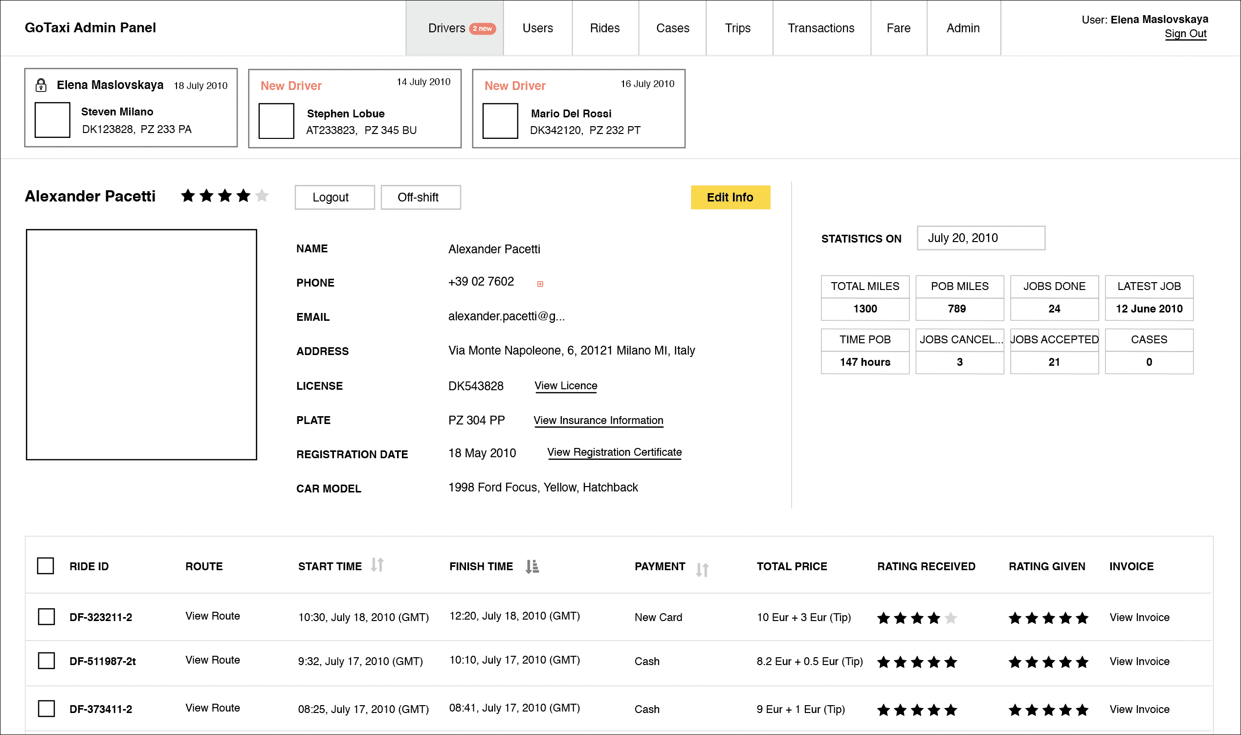
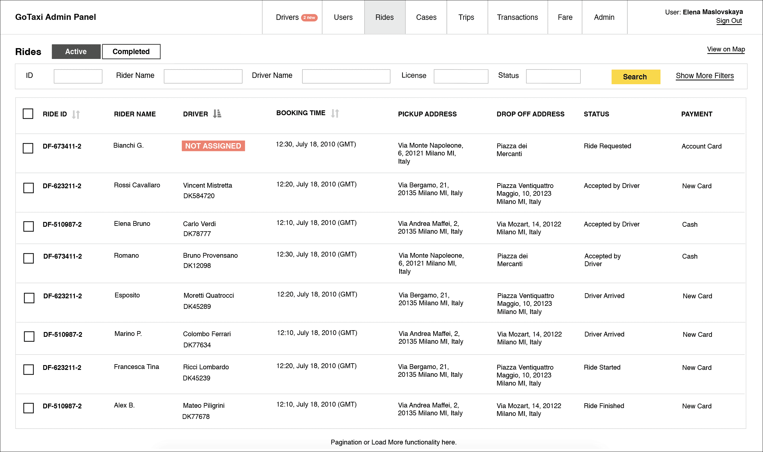
3) Admin Web Panel
The admin panel is the main management tool for taxi operators. The supervisor manually approves license information of new drivers. The admin panel consists of information about all drivers, users, rides, transactions made, driving statistics, and other data. It also includes support case history and lets the operator communicate to users via email/app.
The technology applied for MVP:
The applications are compatible with: iPhone 3GS, iPhone 4, iPhone 4S., iOS v 5.0. The admin panel and the web site are compatible with Internet Explorer 9+, Firefox 12+, Safari 5+, and Chrome 19+.
The apps use CyberSource APIs for payment operations, Google Maps as the main map provider and Bing as a secondary one, Apple Push Notification Service API for notifications, and Twilio for SMS.
The server is designed to process up to 500 requests per second for MVP and it’s recommended to extend the solution by implementing a distributed server cluster with load balancing or a comparable solution. Hosting of MVP (deployment server) is a Debian/Ubuntu Linux server.
THE VISION
Involuntary being the bottleneck facing both the stakeholders and the team (the engineers are not entitled to communicate to the clients), I had to make sure that the product vision is communicated transparently.
Our clients previously did the ethnographic research and knew precisely what kind of software they needed and why. They had clear expectations on the desired functionality and had sustained access to end users. However, the stack of ideas was constantly evolving as their research progressed. As a manager, I decided to represent the vision in the form of a provisional user journey, so we can easily track the pivots of functional logic development.
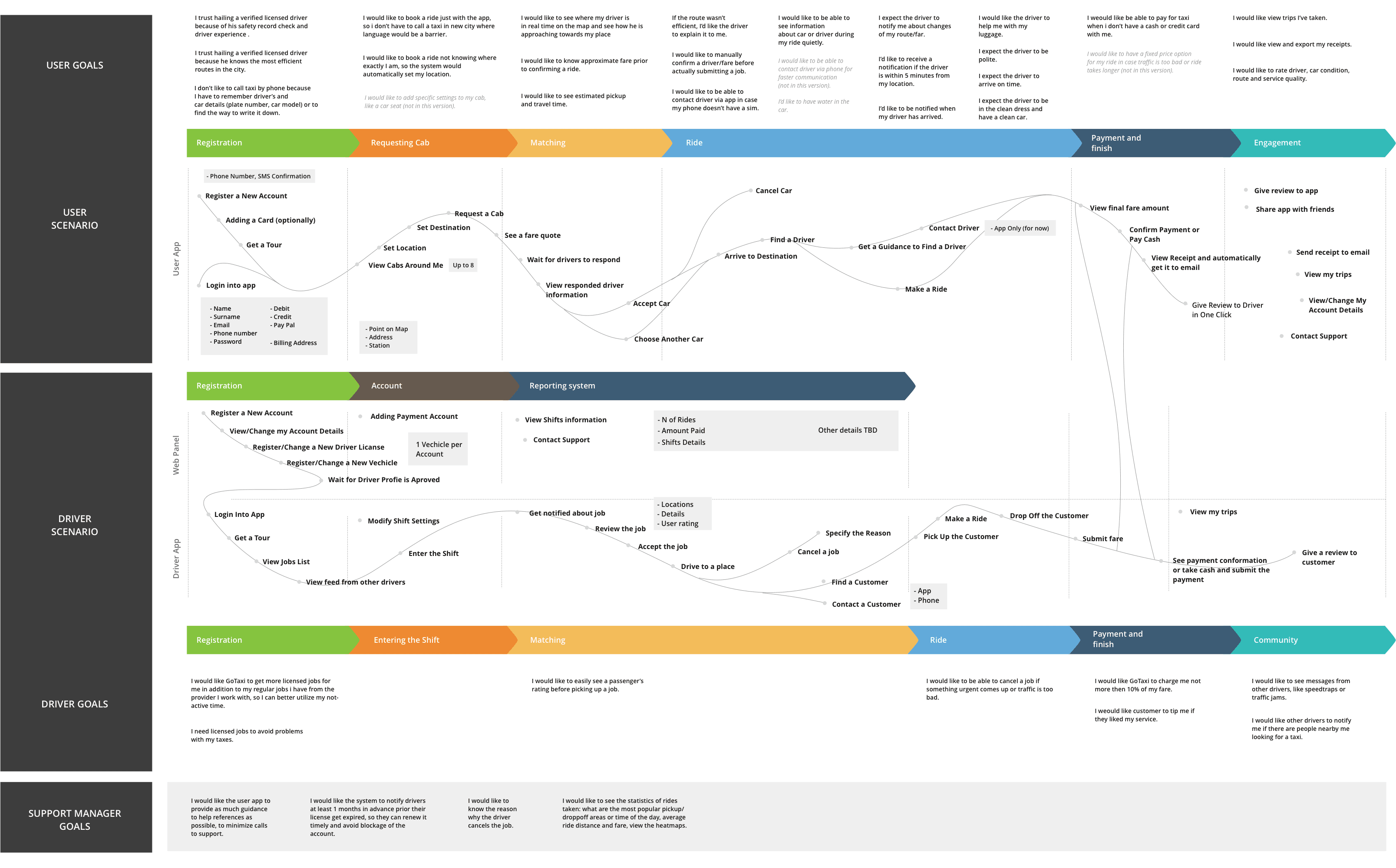
Based on the feedback from users and drivers that our customers performed regularly, we were mindfully adjusting the Journey map. For example, our assumption that the user would need to see the driver’s information prior to booking a taxi was not accurate, so we omitted this step, letting the user confirm the ETA only.


INTERACTION DESIGN
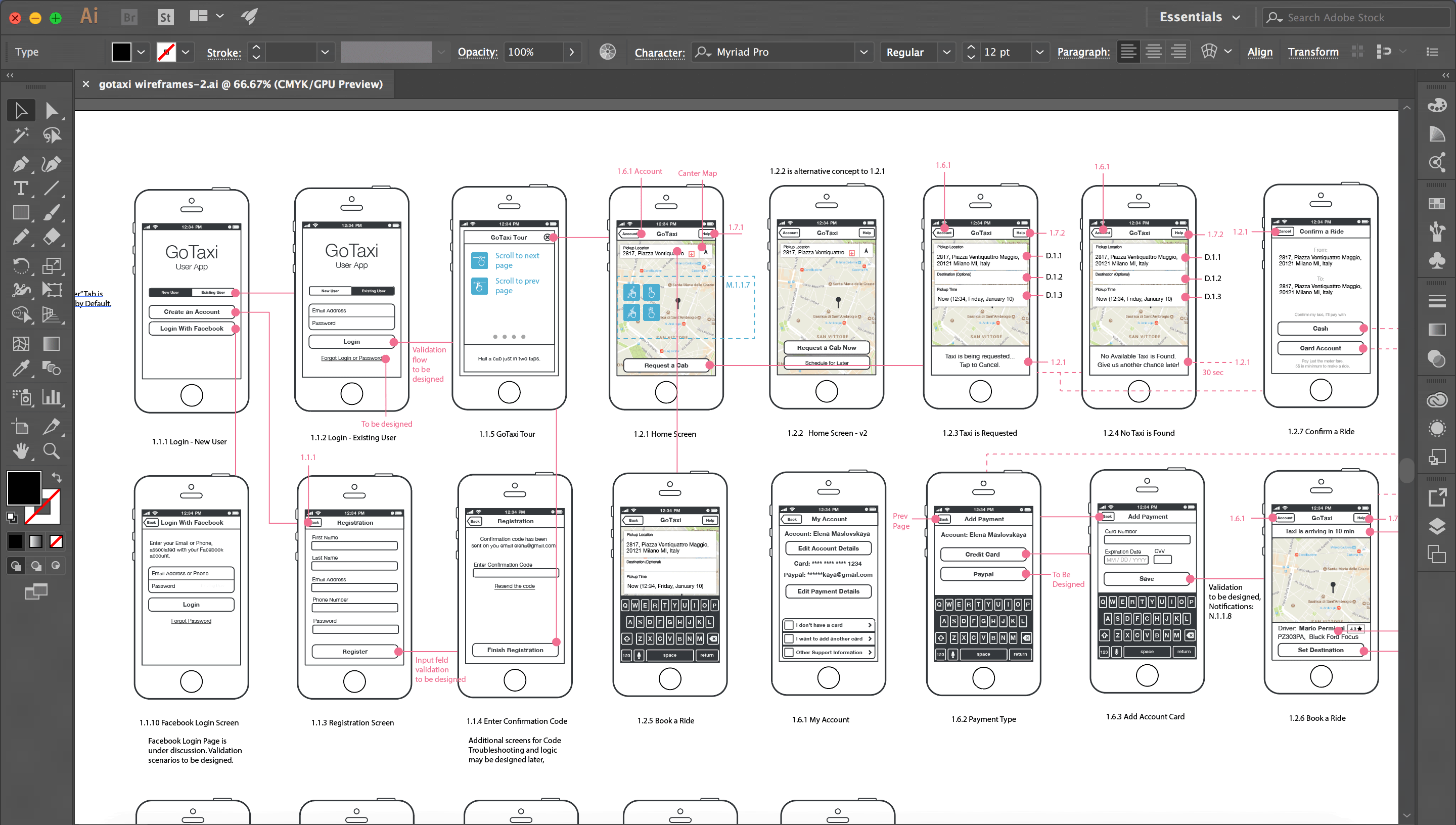
I created a set of wireframes for this project, including User app, Driver app and Admin Panel. Wireframes, created as a design tool initially, benefited the overall process greatly. A detailed visual work breakdown helped to communicate spec changes and provide an accurate development estimate.
The Admin Panel however, was ambiguous. We didn’t have a clear understanding of the Journey of a taxi management operator. Examples of existing systems were given to us, but the use-cases were different. Besides, these systems were outdated and could not be a good example of a user interface. More user research needed to be done, but considering the tight schedule, we created flexible layouts that were easy to develop with most of the frameworks.
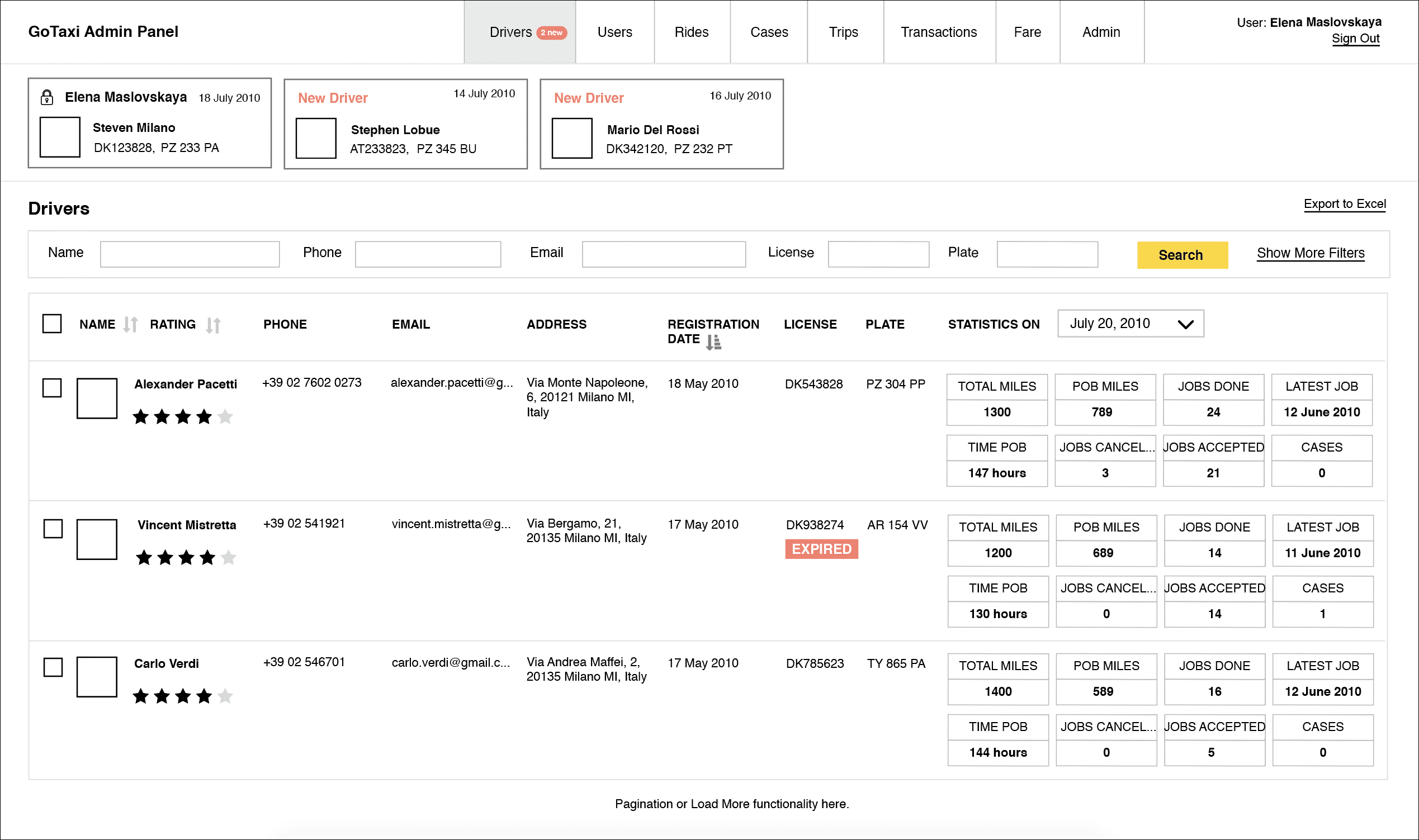
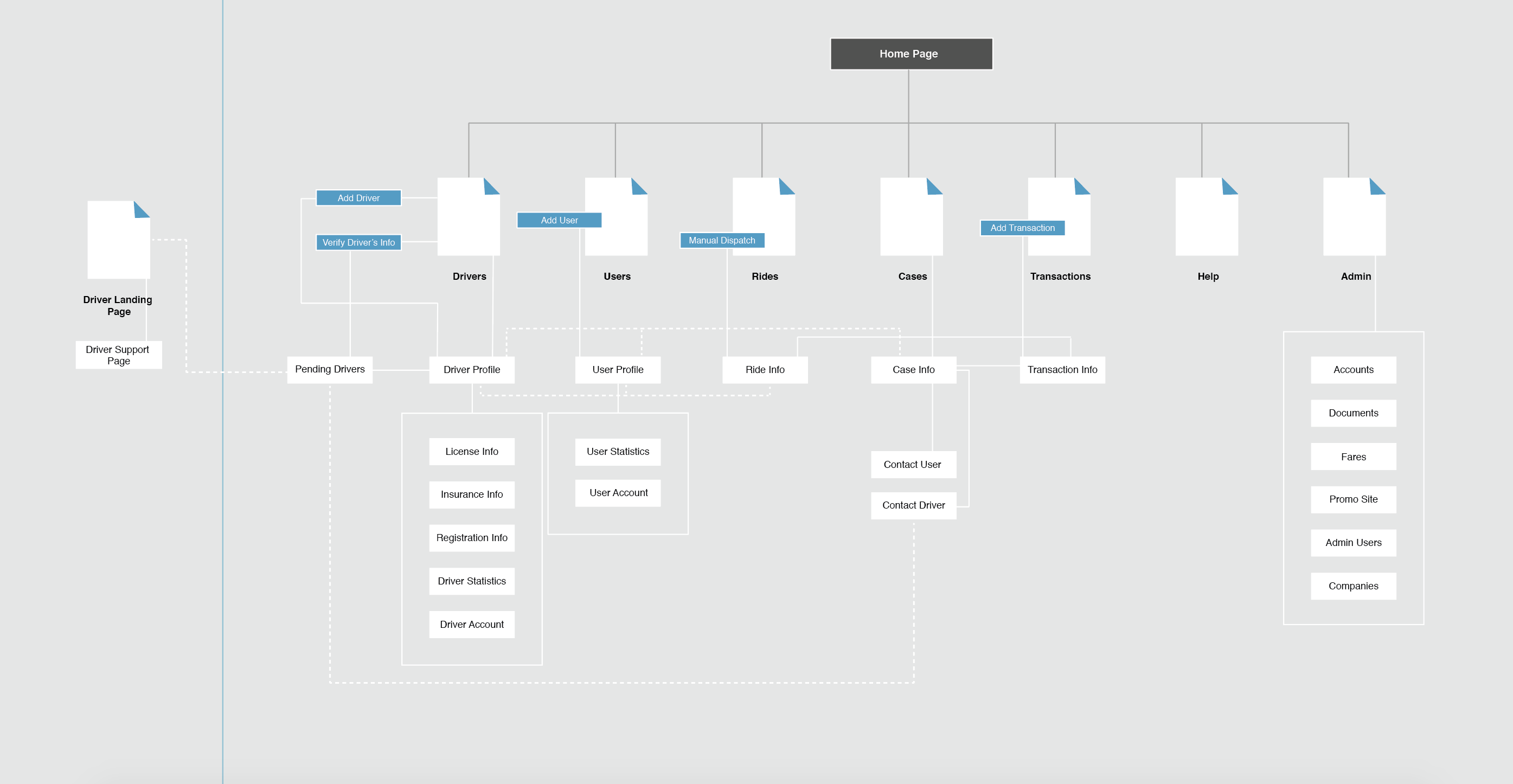
I’ve also created a Site Map for the Admin Panel to validate assumptions about scope, and complexity, and as a visual view of feature requirements.
USER APP DESIGN
As a good practice, at the beginning of the design phase we provided two graphic design concepts for one or two screens of the app. As a design team leader, I prefer to get different designers involved for this step, as it helps to uncover fine distinction of their unique style. The designer, whose variant was chosen by the clients continues to work with the interface.
I enjoyed working with Vitaly Asadchy, who created the designs for User and Driver apps. A fragment of the user app UI is on the images below.


DRIVER APP DESIGN
Interviewing drivers uncovered that they would prefer the darker color tones for the app, as they work night and evening shifts most often.
A fragment of the driver app UI design is on the images below.


THE PROJECT PIVOT
As a result of close team work, my engineers made a detailed scope breakdown as well as created functional documents to describe backend architecture and planned technology use. However, our clients decided to proceed with the development work with the other vendor.