Appery.io
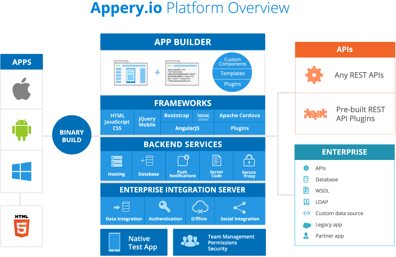
Appery.io is a cloud-based application development platform that provides integrated visual design, development, deployment, and integration services as one product. It has both the front-end tools, and also back-end services and supports several JavaScript frameworks, including AngularJS, Bootstrap, and jQuery Mobile.
MY ROLE
After doing freelance UI/Interaction design for Exadel previously, I was invited in 2013 to improve the Appery.io admin panel and the App Builder.
My responsibilities included: defining the UX strategy, enhancing the actual user journey, site maps creation, performing surveys, and active users interviewing, usability testing, creating a proposal on the IA change and UI design.
THE RESEARCH
Targeted as a software development tool with a low learning curve, the Appery interfaces seemed to be intuitive and easy to use. My own initial usability testing of the provisional journey revealed some minor issues, but did not explain the pattern of decreasing user engagement. The most critical step was to understand how users’ real journeys differed from mine, and also obtain as much qualitative user feedback as possible. Working with the existing and potential users I was asking questions as well as observing their behavior.
I summarized my findings into reports and empathy maps. With the interviewing progression, the amount of user feedback grew exponentially, so a map per scenario was the most optimal way to organize the data.

I also worked closely with the customer support team as they handled support cases and had already collected a large base of known issues.
ANALYTICS INSIGHTS
Digging into analytics revealed some interesting shrewdness in the platform learning experience. Behavior flow and Events were the most helpful, as they provided details on unexpected work path fluctuations.
For example, 36 percent of users were opening the Docs/Get Started page prior their attempt to create the first app, after applying for trial. That could mean that it’s not evident where exactly the button is to create a new app (or that the button is not functioning correctly on some platforms). After the design improvement for this hypothesis, we checked the analytics again in 2 months and found out that just 2 percent of users refer to docs before creating their first app now.
As another example, we saw that users clicked “Create New” dropdown control multiple times during a session in App Builder and then not finishing their action. Behavior flow revealed that during the same session they also created a new app version in the Admin Panel. I assumed that the “empty” click was related to the attempt to create an app version inside the App Builder (which is not possible). Later the interviews confirmed it.
DEFINE A SUCCESS
In collaboration with the product team, I defined UX goals and metrics. The most challenging part was to narrow down and prioritize project and product objectives to a relatively focused list. Every stakeholder and team member had their different opinion of what the product goals should be. And what is even worse, they were far from what actual users expressed during interviews.
Discovered user goals that did not match the product strategy, carefully nourished by a product team, were overlooked. Others were prioritized with the impact on the “product growth”. So “UX goals” became “goals” and I confided in the product team’s expertise until I had better knowledge and vision of the product.

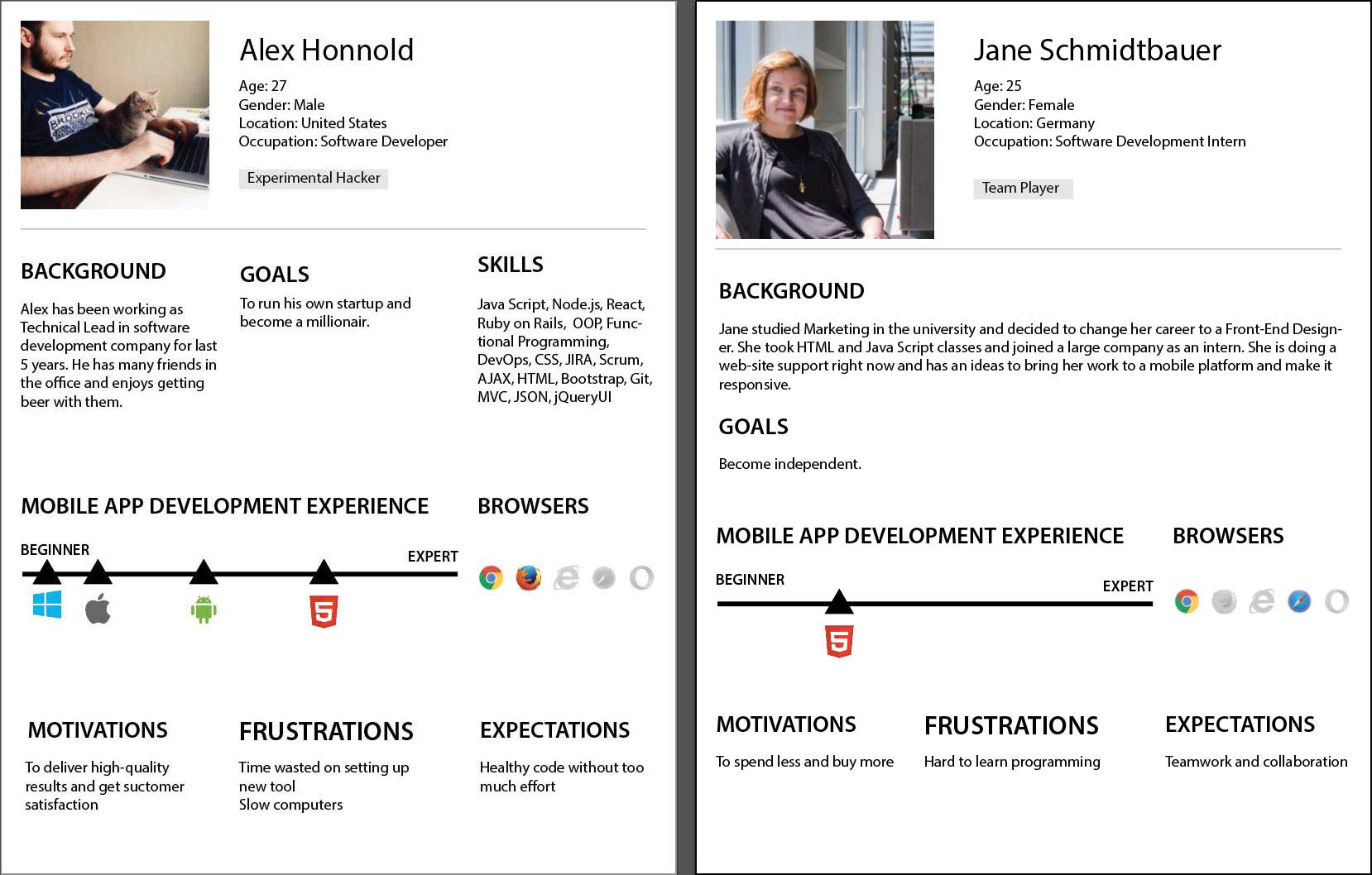
PERSONAS
At the beginning of the project, I was told that the user (persona) was a “Software Developer”. Personally to me this goal seemed to be too broad and I felt uncomfortable trying to imagine potential characteristics for such a capacious type.
Also, I had a poor understanding of why engineers would like to switch from using their familiar IDEs to a new one. Apart from getting answers to “Why” questions, other factors to be considered to determine whether a user is willing to use the platform include:
– Skill Level
– Need for Speed
– Ability to Code Manually
– Predisposition to Learn new Framework
– Willing to Work Online Only
– Experience with XCode, Android Studio
– Experience in HTML5
– Need for Multiplatform App
– Etc.
The Appery team had no budget to conduct ethnographic research. In my free time, I interviewed 10-15 existing Appery users who were enthusiastic about participating, and created two personas. I felt that these personas were not enough to consider them a complete tool to describe Appery users due to a quite narrow cohort selection, but it was a perfect tool to communicate with the Product Management team effectively while discussing user feedback and further changes.
BEING A DEVELOPER
Having user feedback in hand without a complete understanding of a real user journey is like a puzzle. You hold a piece, and you can even see the details of this piece, but you don’t feel how exactly this piece contributes to the whole picture until you progress enough.
To be able to understand the product better, and as homework for the planned User Journey map creation, I paired up with Exadel software engineers and created with them real-case Apps for Exadel customers. I was sitting at the same desk with them and was even writing some code at the same workstation. As a result of such “pair-programming” sessions, an impressive number of elusive insights were discovered.
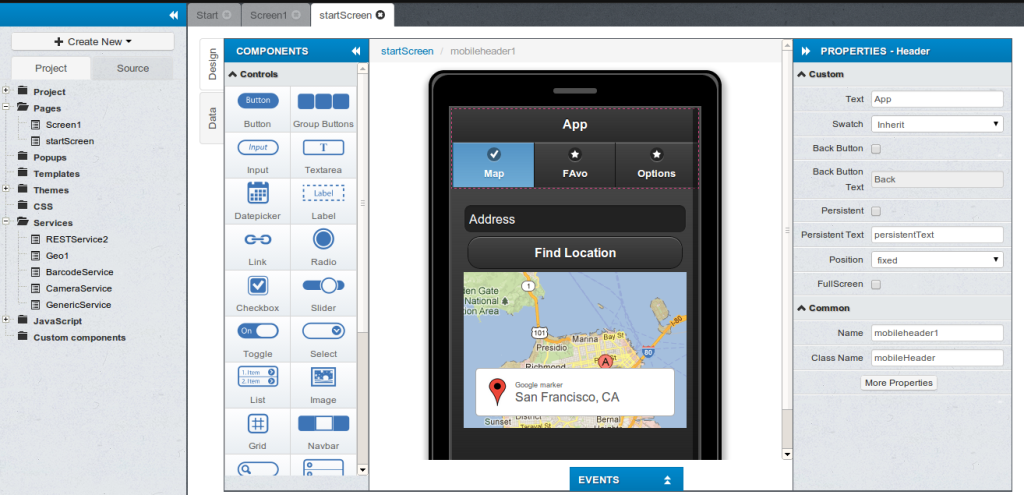
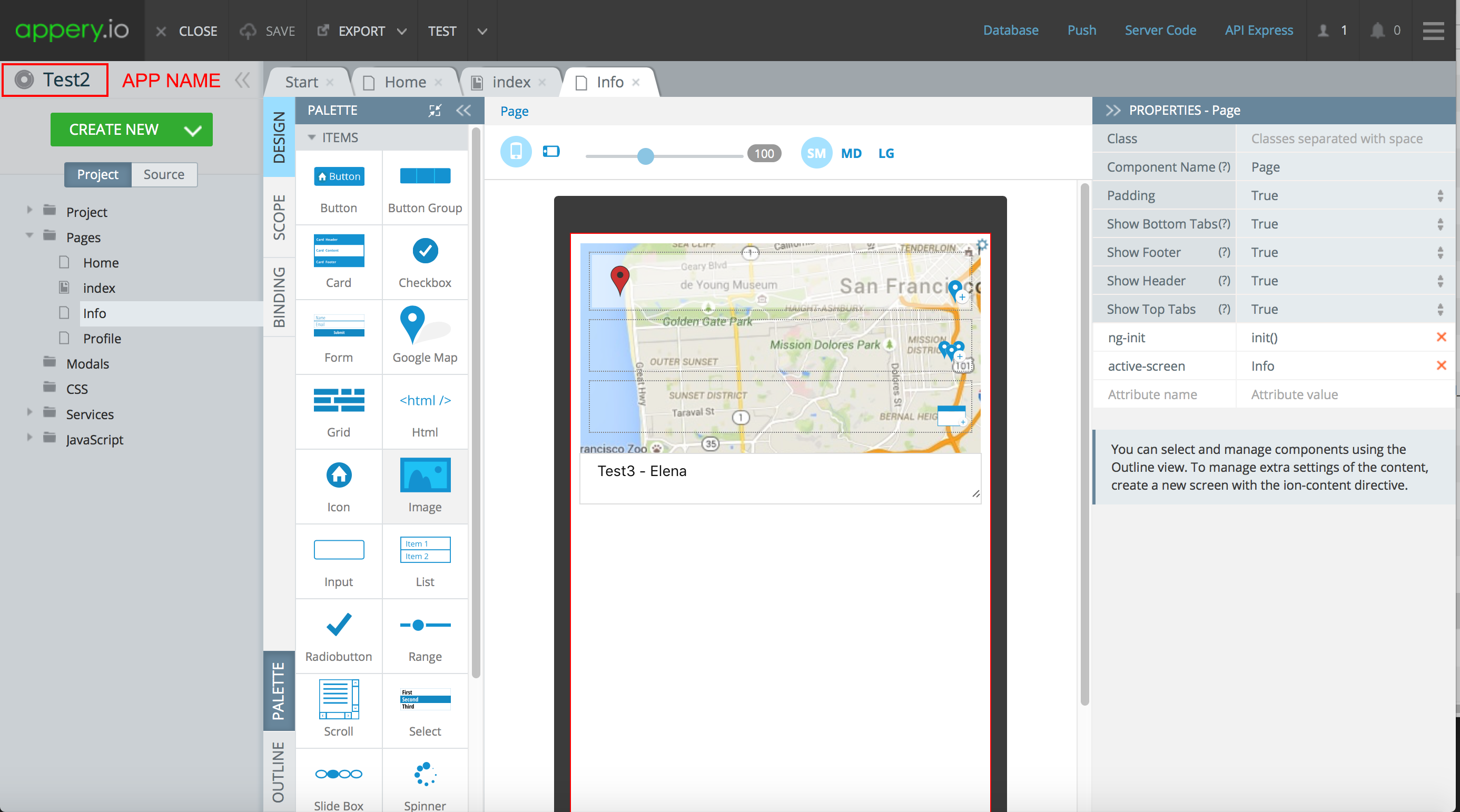
Appery publishes case study apps in the Gallery. One of the apps developed with my linear involvement is in the pics below.


THE FINDINGS
As a result of a feedback collection I summarized my findings in one document. This is where our personas appeared to be very helpful as an effective tool to prioritize the list.
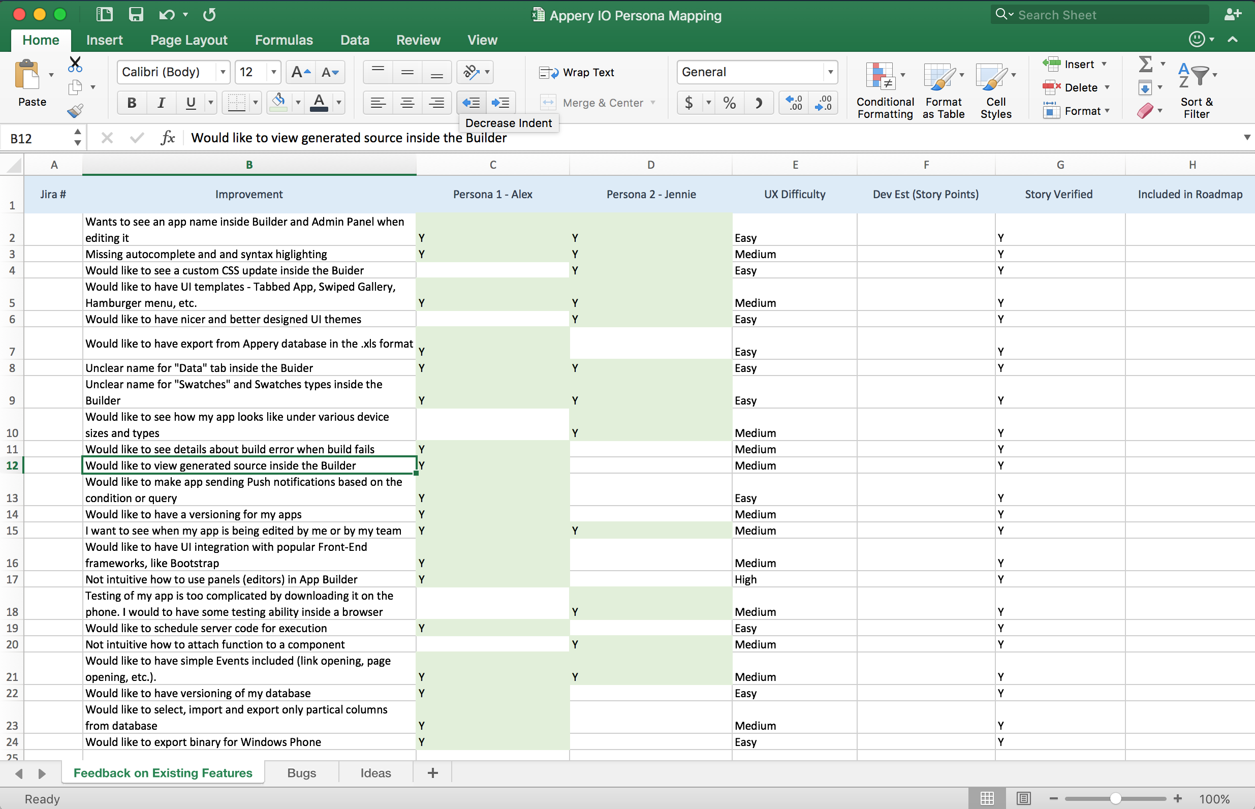
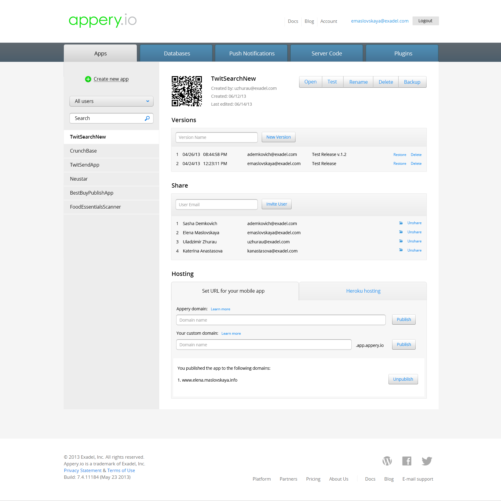
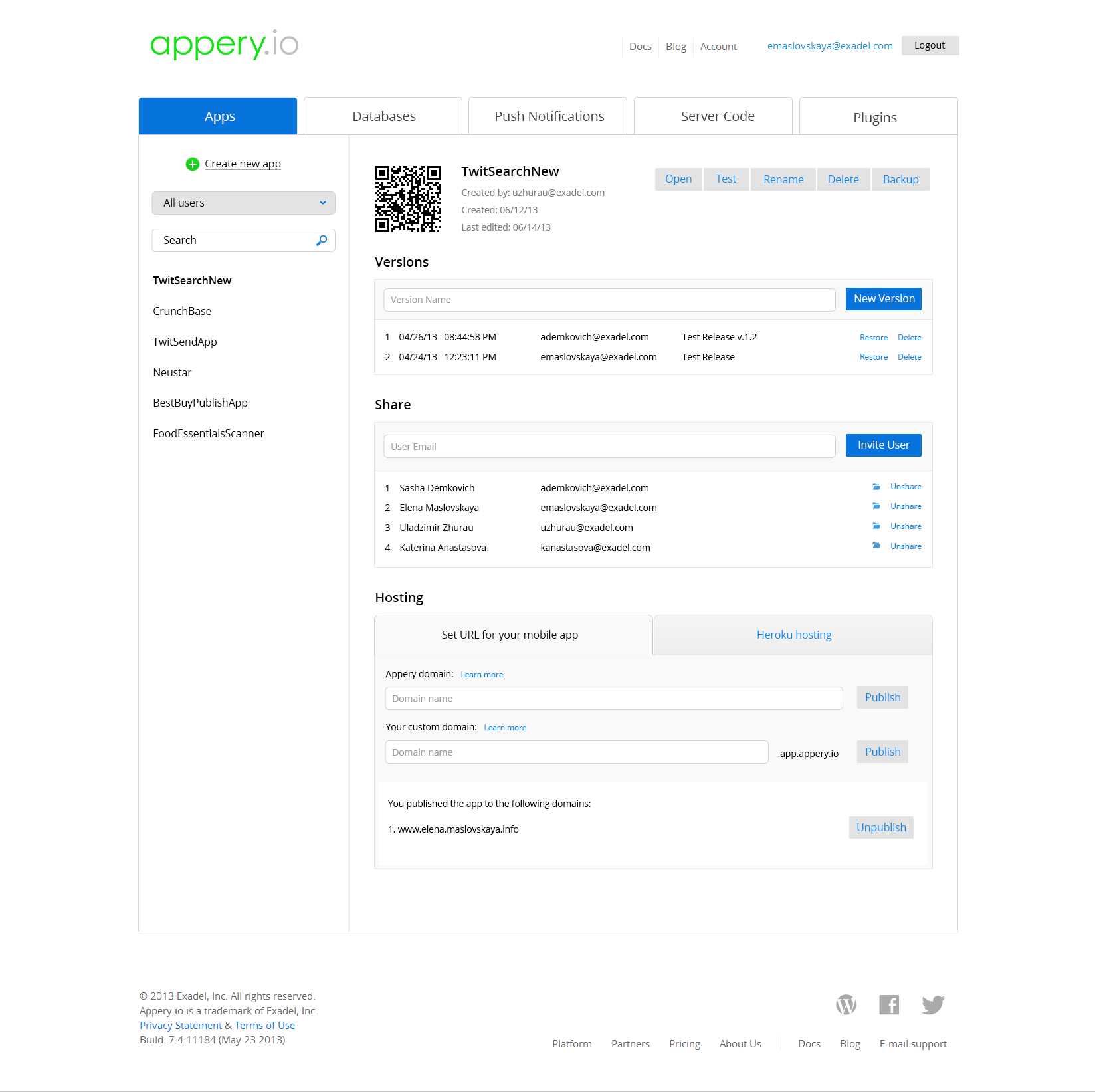
Some of these important feedback items were easy to fix. For example, the App builder didn’t tell you which project you are editing right now (left image). Adding a project name (right image) took no time, but improved usability.
Some feedback items, like viewing CSS changes inside the builder, were easy to design, but not quick to develop, so product marketing team took over the effort to determine the priority to implement them.
Others, like having non-intuitive panels inside the App Builder, required more study and designing effort, so my work continued with a deeper study and the interaction design.
IMPROVEMENT BARRIERS
ADMIN PANEL IA IMPROVEMENTS
Admin Panel changes, compared to App Builder, were relatively easy to implement. UX study revealed that users struggled with doing basic steps such as adding database tables into the project, connecting to API, creating an app version, or scheduling basic push notification. Also, the navigation of the admin panel was overcomplicated, which resulted into unnecessary clicks, frustration, losing control, and poor task performance.
To improve the Information Architecture I did card sorting with the Appery engineering team and then developed it into the “Reverse Open Card Sorting” method with in-person and online respondents. Participants had a list of root categories and child elements, which they would arrange according to their suggestion, and add or remove items if needed.
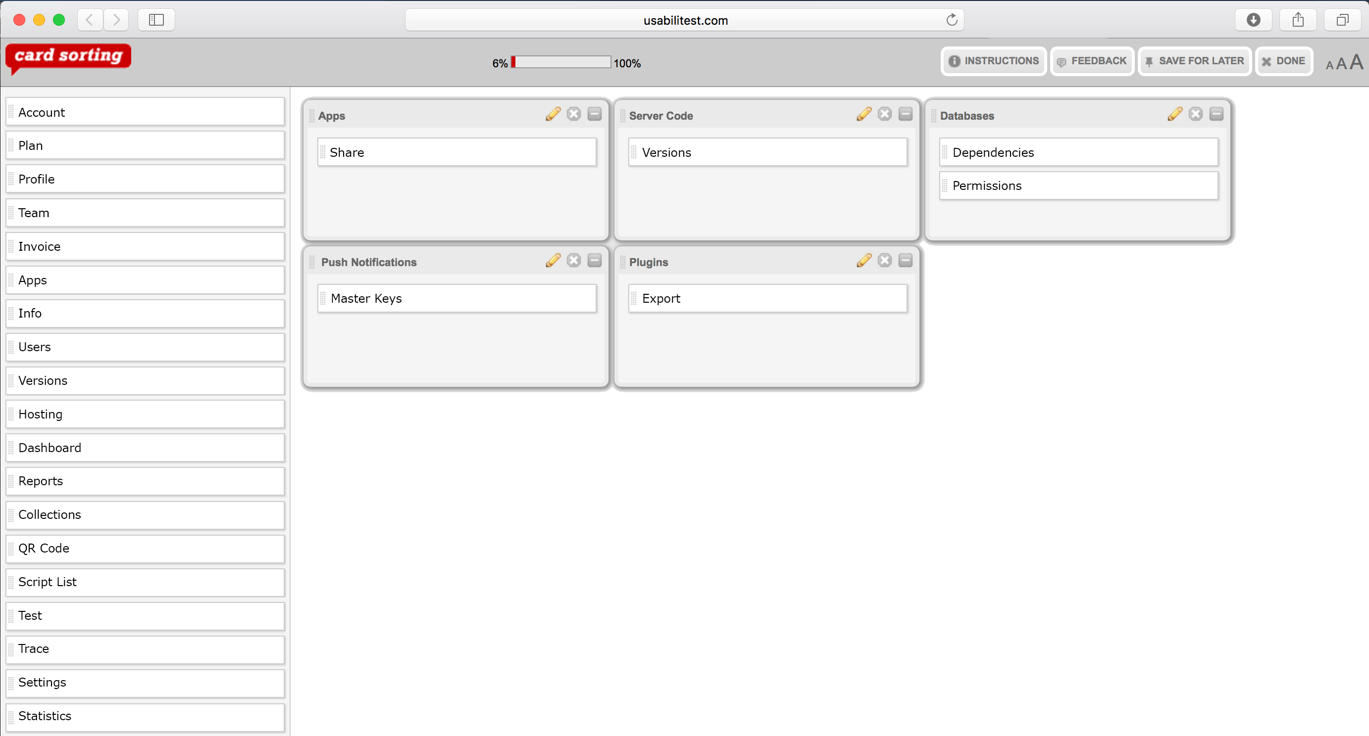
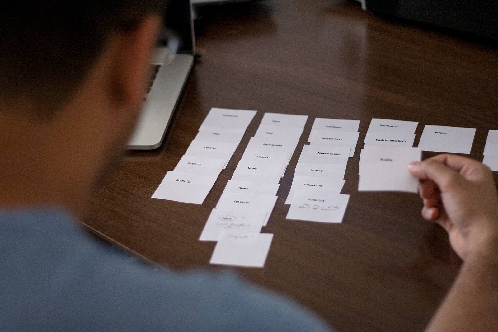


Several iterations were needed to get the satisfactory result. The biggest challenge was to aggregate different opinions in one map and also get the product team’s opinion aligned.
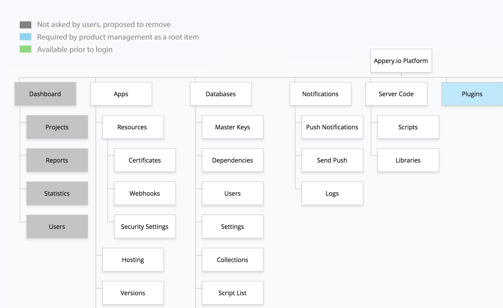
Main navigation was significantly improved by providing consistent and transparent interaction between parent and child pages, such as: “Apps/App”, “Databases/Database”, “Server Code/Code Page”, etc.
Images below show wireframes of child page potential layouts (A, B, C, D, E):


After internal discussion and brainstorming, Variants A and B were prototyped and tested with end the users.


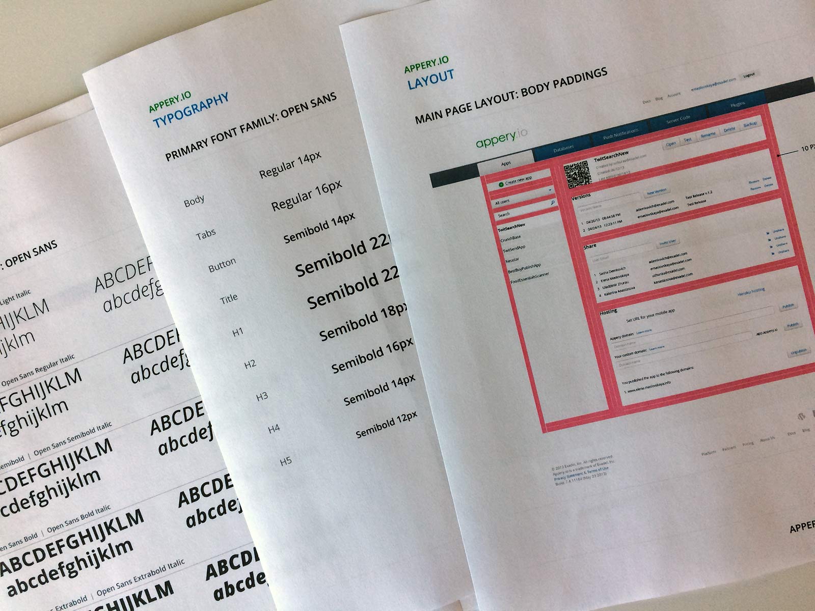
HIGH-FIDELITY DESIGN
I created two differently styled mockups and let the Appery marketing and product teams select the favored one.
For the engineers I’ve created specs and was actively involved into the QA of these changes.
IMPACT
Users liked the changes we made and the new UI design for the admin panel.
The analytics metrics were improved in the next three months after bringing the new design to life, such as:
– Avg. Session time increased by 9% for active users
– The number of published apps increased by 11%
– The number of created database versions increased by 4% per active user.
For confidentiality reasons, I have omitted the actual values for these metrics.